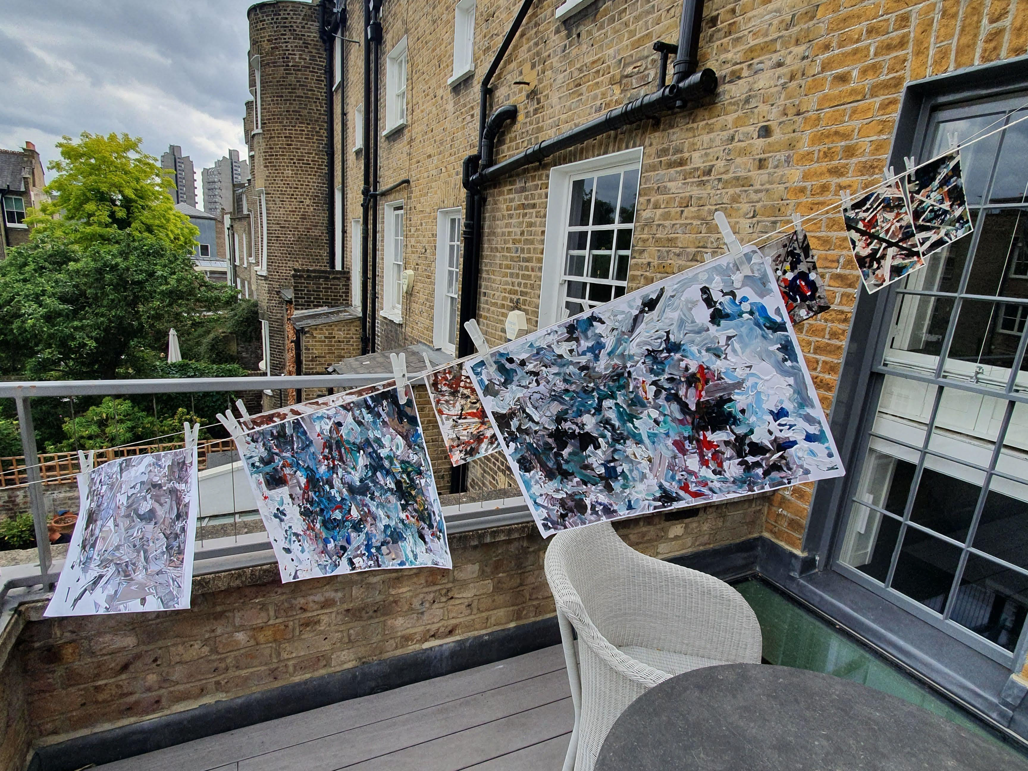
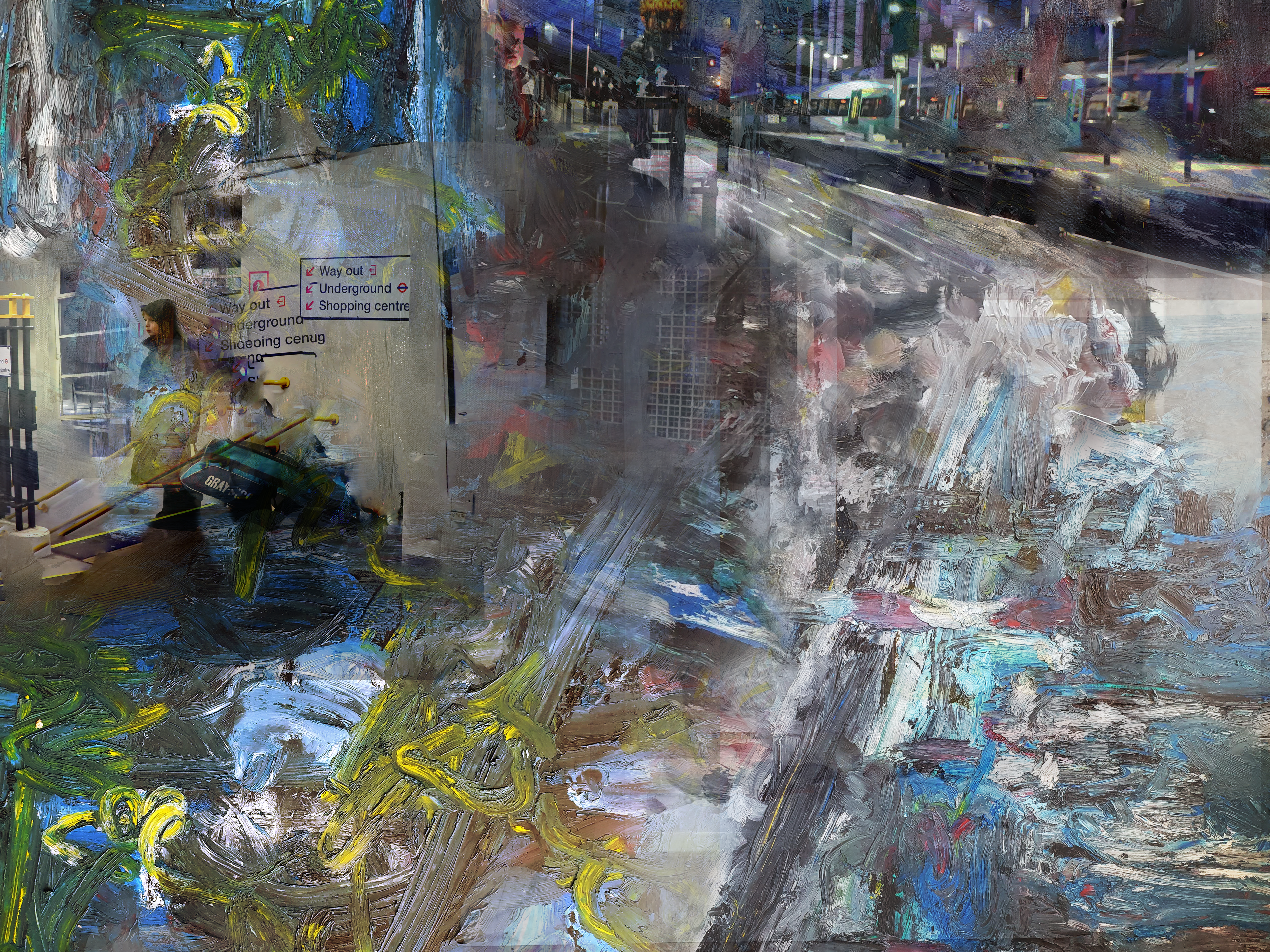
After experimenting with photoshop for my 'Digital Layering' series, I decided that I wanted to delve deeper into learning about how to use the software, along with experimenting with the merge tool more - to push my images to their absolute abstract limits.
I needed new source material so I started by taking a series of photos of the angular architecture of my school. I wasn’t sure at first what I wanted to do with them but, looking at the lines and the angles, I knew that I wanted to merge them all into one image using the same transformative process that I had been applying to my other images.
To continue on with my theme of 'dreams', I wanted to make something that confused the viewer - making them feel like their reality was shattering in front of them.
I tried to take photos of lots of different angles and perspectives to give myself options when it came to photoshopping them together, and I tried to keep the colour palette fairly similar – which was surprisingly easy as the inside of all of the buildings was mainly white, red and black.
Editing them together was really successful. I liked how if you got up close with them you could see the individual pieces – the windows, walls, etc. – and you knew that it was a building, but if you looked at the image as a whole it turned into abstraction.
I also experimented using the smudge tool to smear the images into each other, furthering this sense of abstraction. I liked the painterly feel that this gave the photoshops.
I discovered the warp perspective tool as well, which allows the user to turn a flat surface into a 3D object – but I found that it wasn’t the end result that I was interested in when using this tool, it was the aesthetics of the tool itself. It works by drawing planes over the surfaces you want to become squares – and I quickly became interested in these interlocking blue lines and pegs overlaid on the image, pushing it further into abstraction.
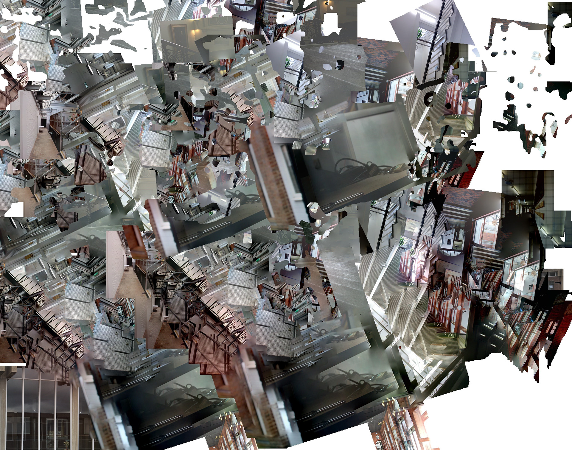
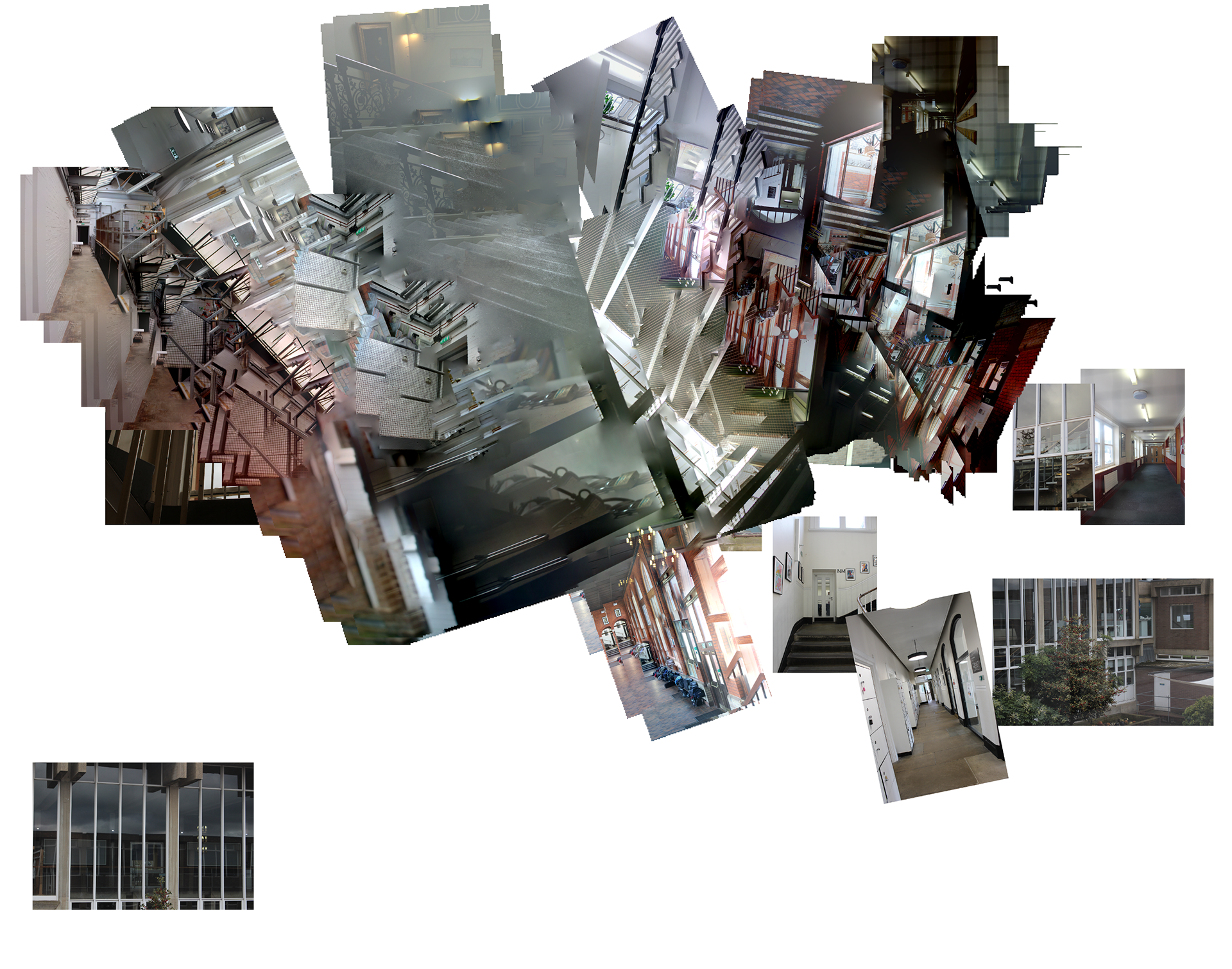
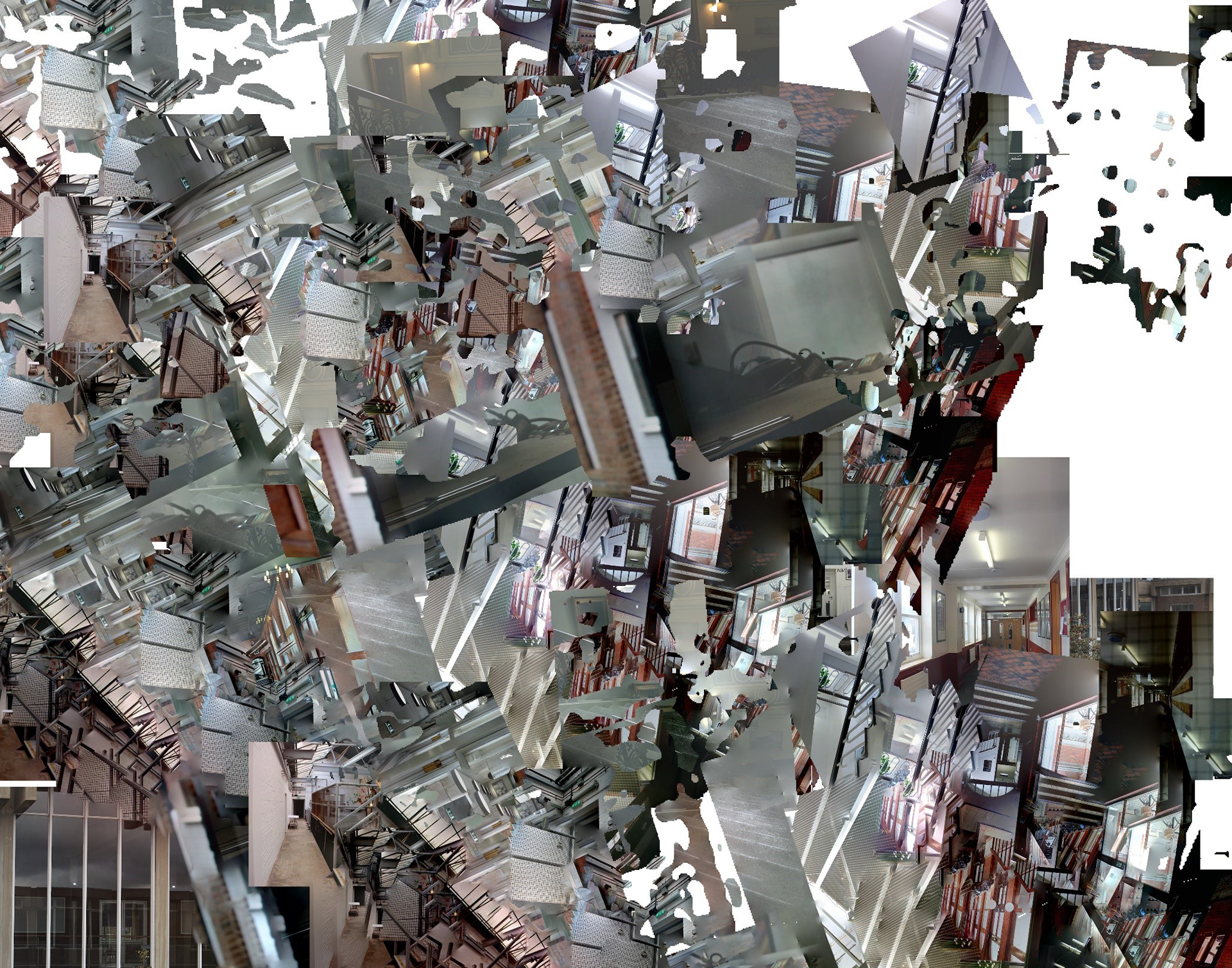
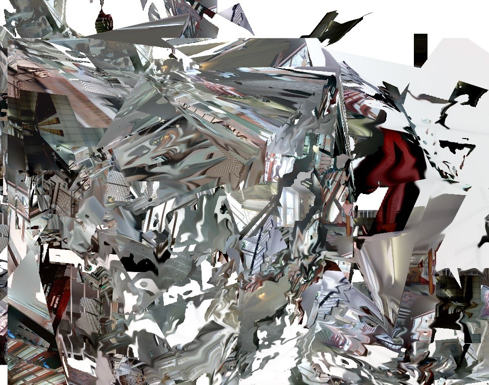
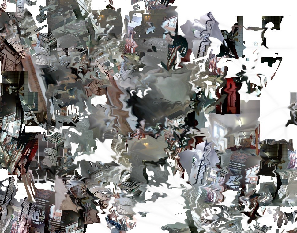
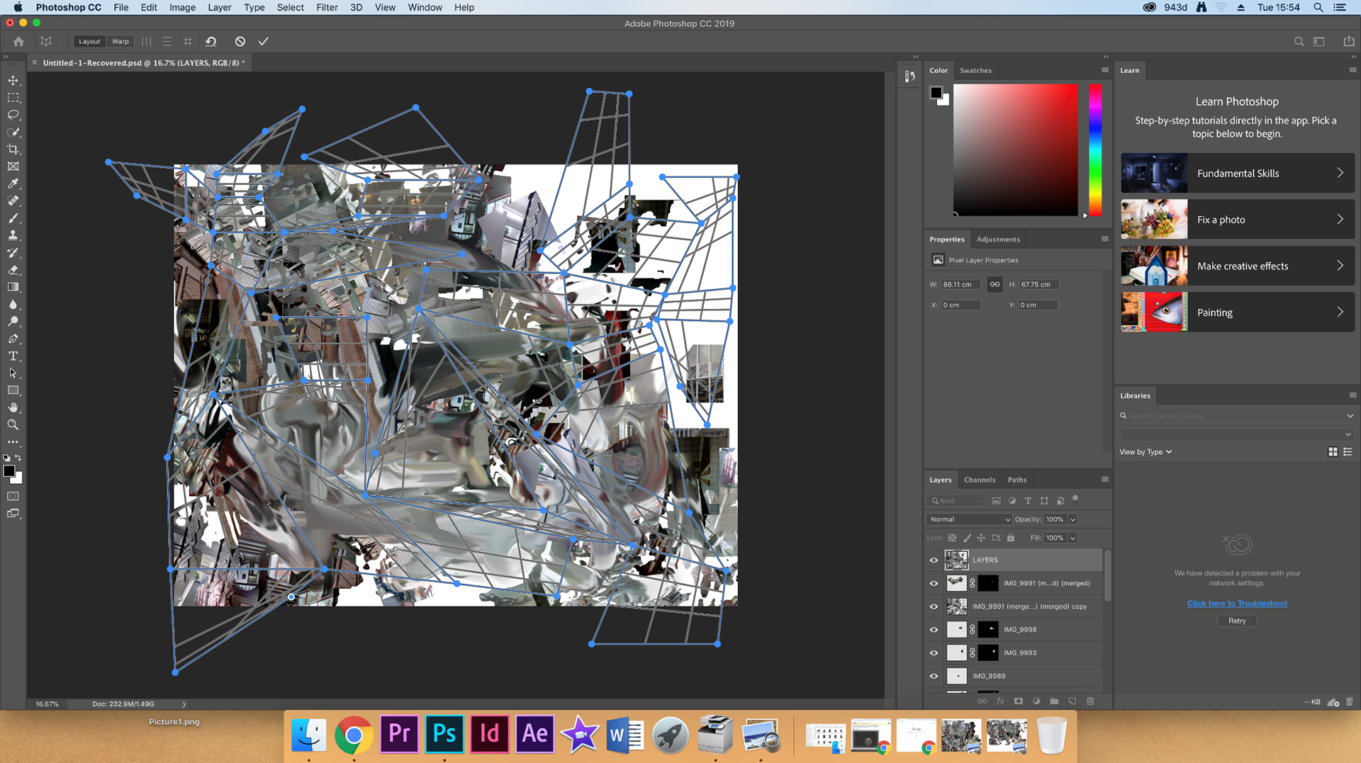
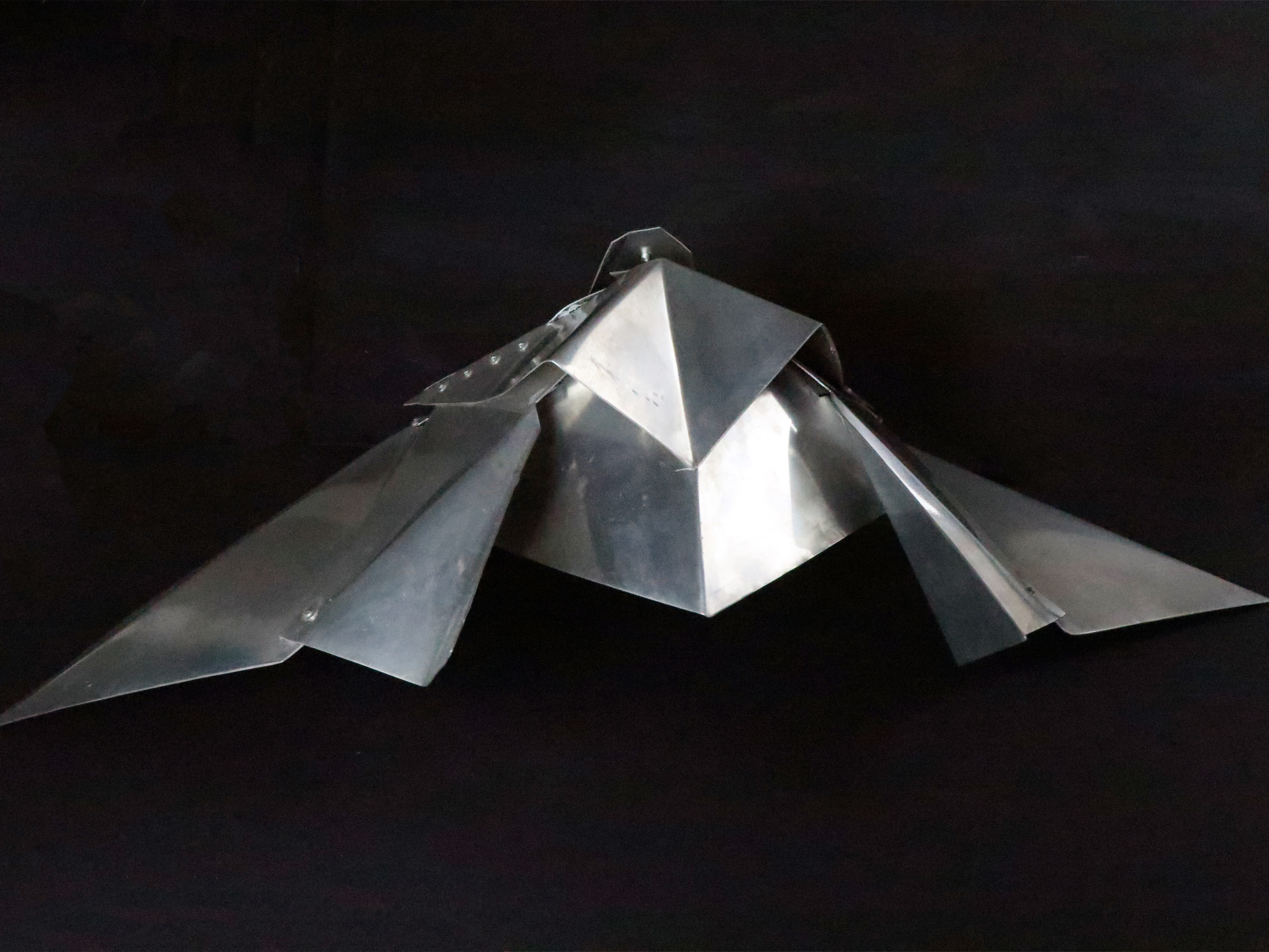
These were the final, warped photoshops – and while I thought they were interesting, the process of converting one image into another was what I found much more pleasing. These warped photoshops became almost too abstract, as all of the images blended into each other to create these architectural shapes. It reminded me of some sort of metal sculpture as all the images blended together to make this metallic grey colour, which was perhaps a bit to dreary for the kind of end result that I was looking for. Going forward, I will continue to explore the architectural lines and the blue overlays – but will still try to keep the image recognisable as these images became too abstract.
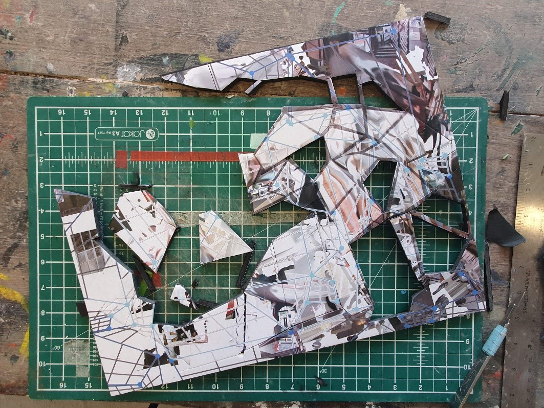
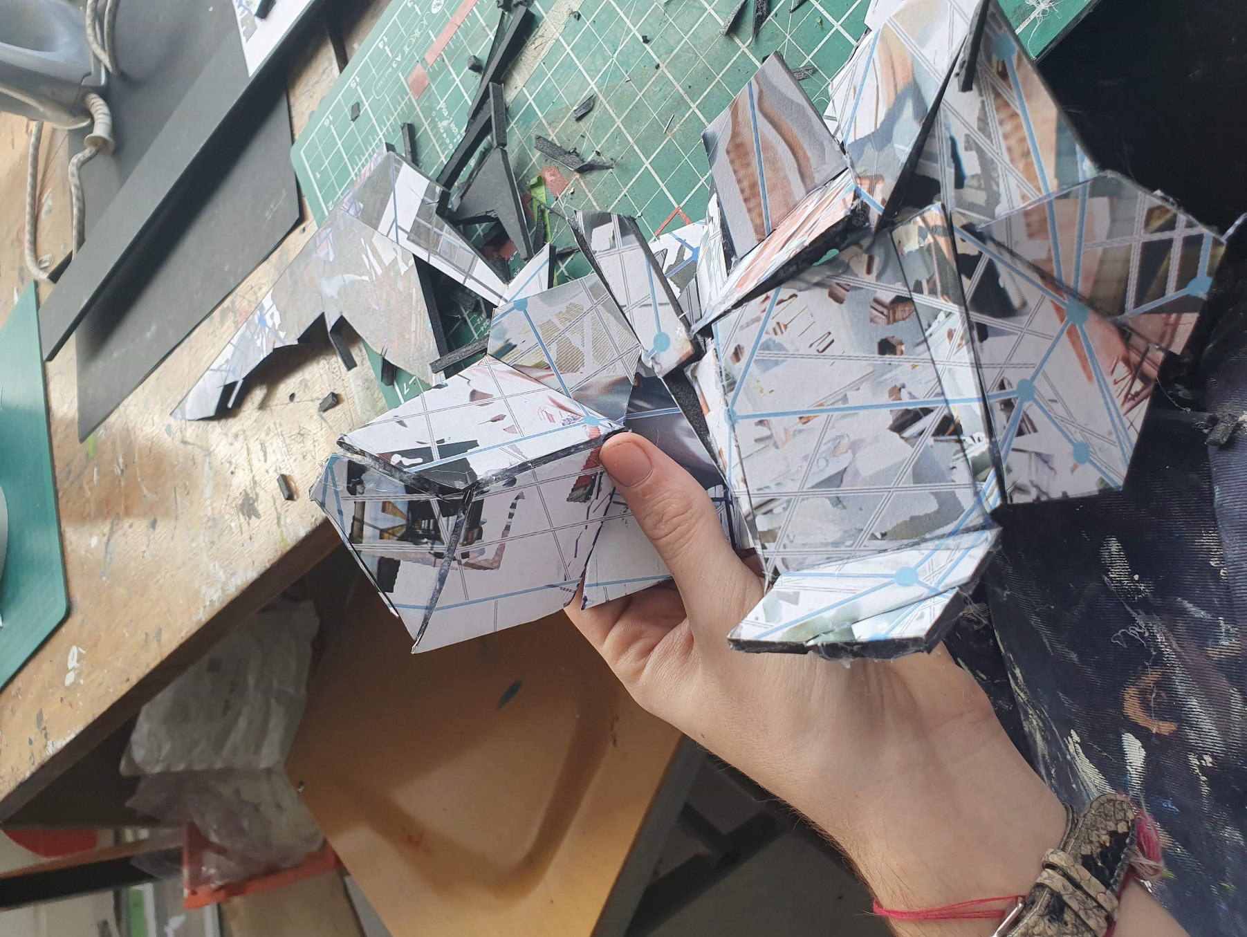

With a deadline for an exhibition coming up, I decided that I would try and bring those warped, architectural images to life by making a sculpture out of my previous photoshopped imagery. I started by drawing a load of quadrilaterals over the image that I had selected, so I knew where to cut (creating a net for the final shape). I then printed out the image and spray mounted it to a piece of foam board so I could cut it up and reassemble it. It was important to me that I hot glued all the pieces together so that if you ‘unfolded’ the sculpture it would transform back into the original image, like a piece of origami. This process took me ages – it was extremely fiddly to get all of the pieces correctly placed. It was also annoying that I had planned out the pieces beforehand as it meant that it took much more time than it should have done. However, I liked the end result and thought it would be easier (and less fiddly) to scale the concept up.

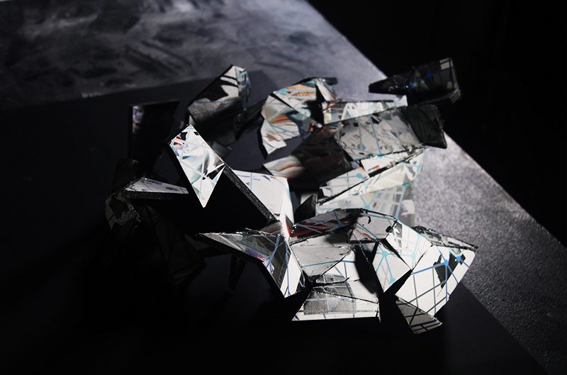
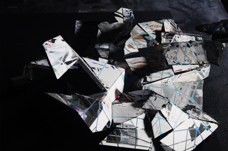
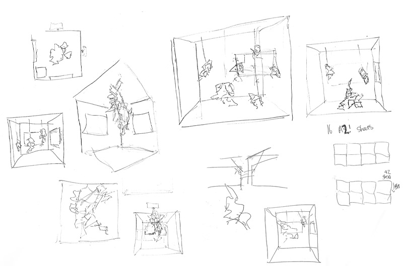
When thinking about how I would scale up my prototype for an exhibition, it was really important to me that I took the space into consideration when I was making my sculpture. I wanted it to look like it was custom made for the space (not just some massive thing plonked down on the ground) and take advantage of this opportunity fully because I was in such a privileged position to be able to display my work like this.
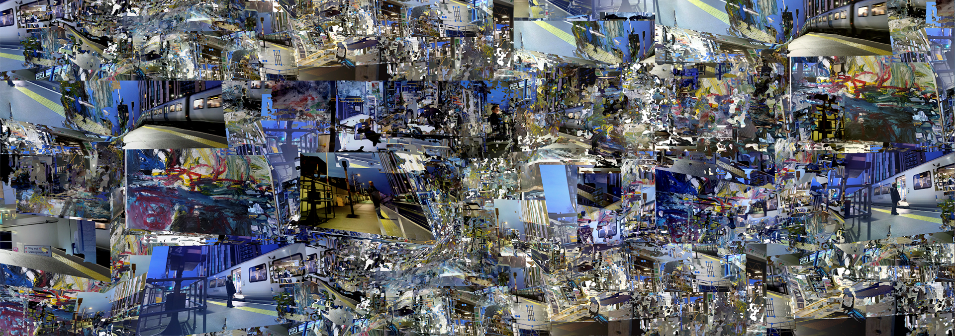
After doing a few thumbnail sketches, I decided on doing 2 different sculptures - wanting each one to represent a different segment of my project – so I chose to combine all of the ‘train station’ imagery into one of them, and then for the other I used all the photos that I had taken around school.
It was a priority for me that these banners were striking at a large scale and also when you got up close – which basically meant that they had to be very high quality, as the final piece was going to be so huge.
I then split these individual banners into 32 A3 images, in order to be able to print them correctly.
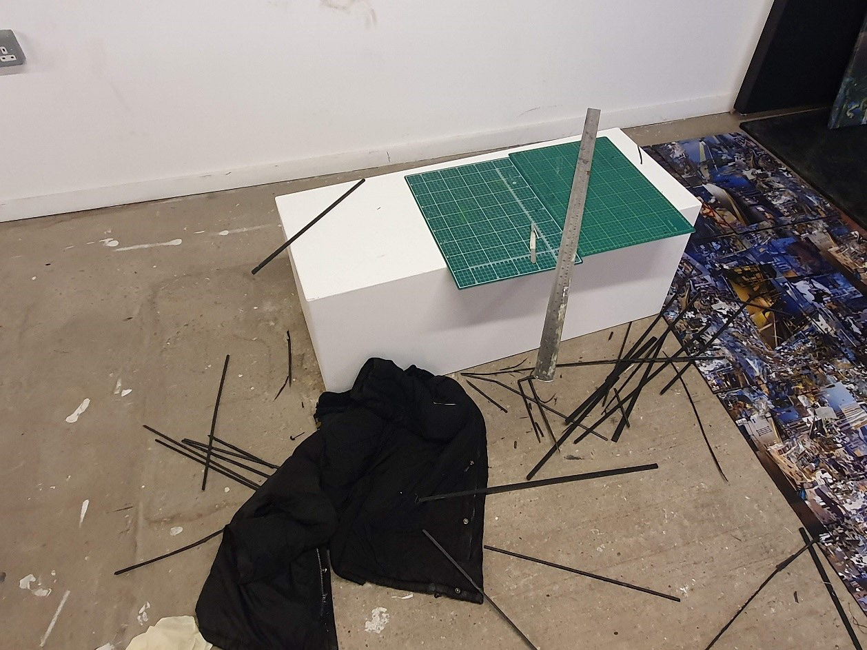
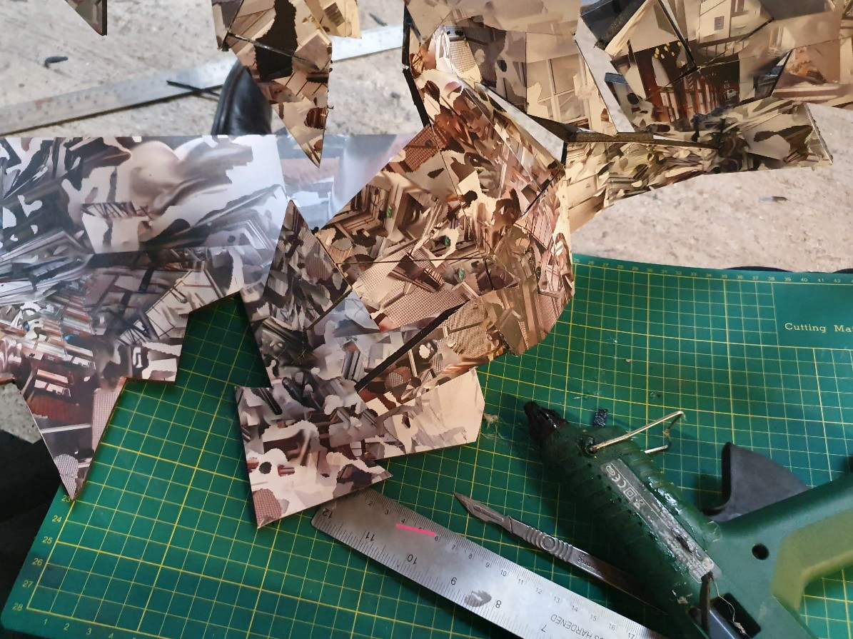
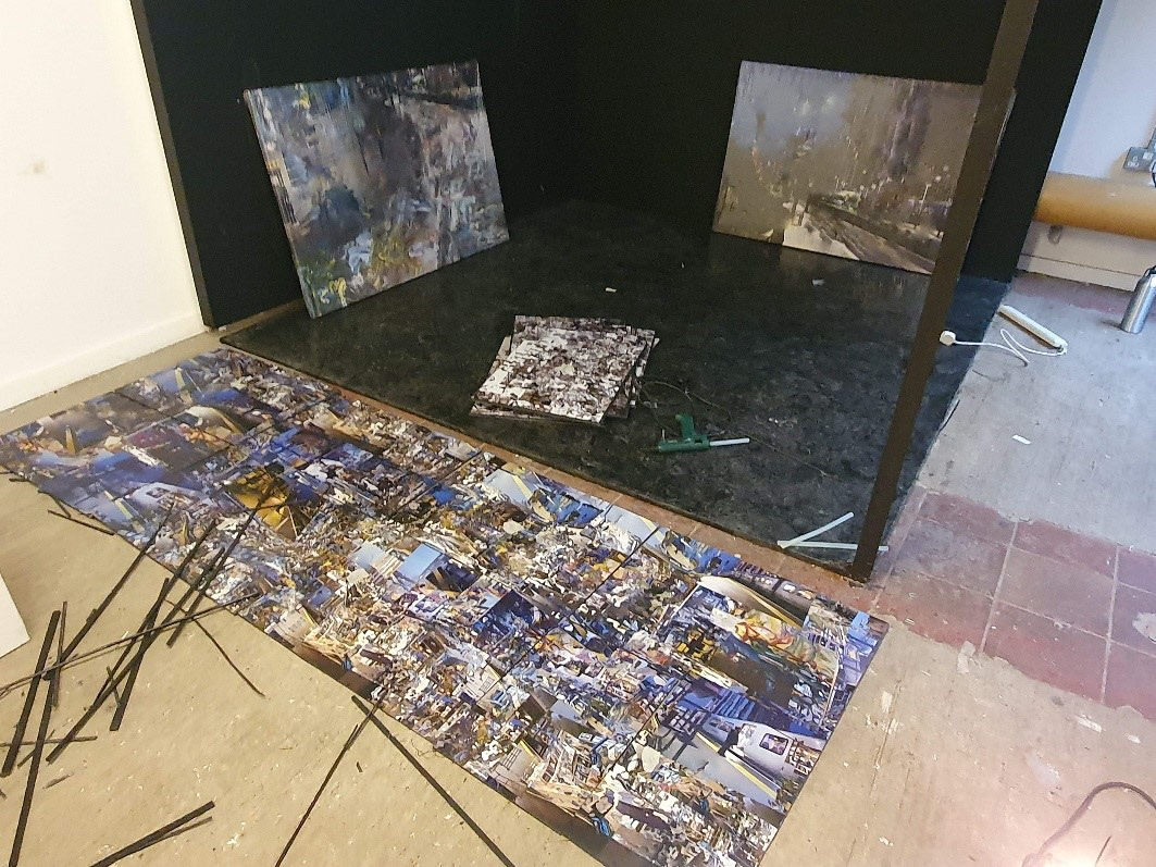
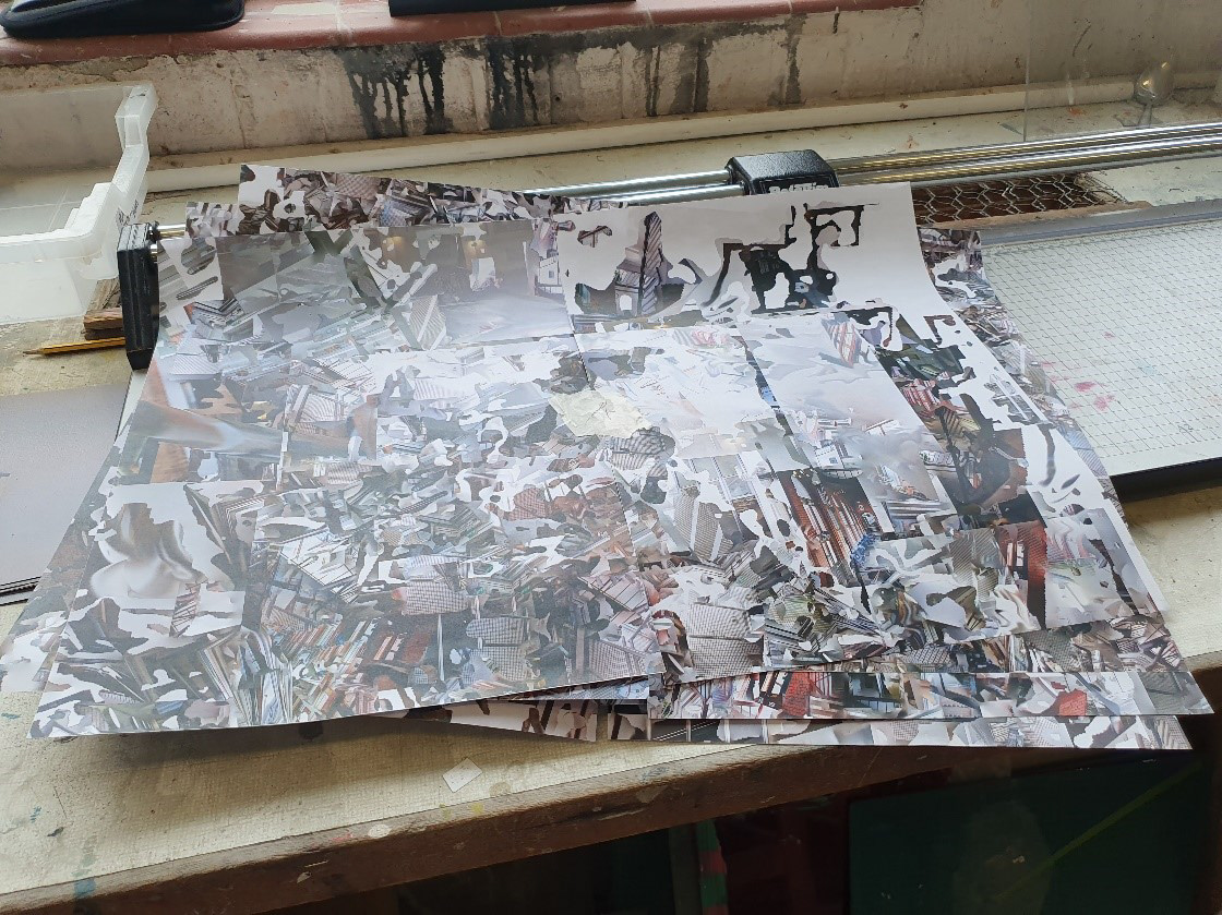
Once I’d got my printouts in order, I got to work cutting the borders, and then I spray mounted them on to the 16 pieces of black A2 foamboard.
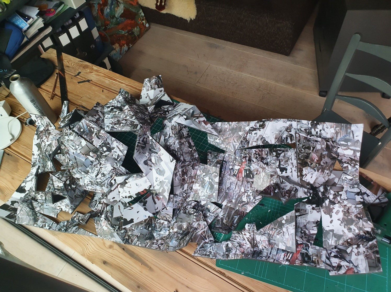
I then trimmed the excess and got to work cutting and sticking together small pieces of polystyrene with a hot glue gun. There was 4 metres squared of foamboard in total, and each piece was maybe 5 centimetres squared… so you can imagine how long this took me.
In the end, though, I was really happy with the result. However, I quickly realised that I wouldn't have the energy or time to completely cut up the other sculpture, but as its base image was less abstract, I thought this was fitting. As you move more to the right in this sculpture, the pieces get more and more small - like the image is dissolving from right to left.


