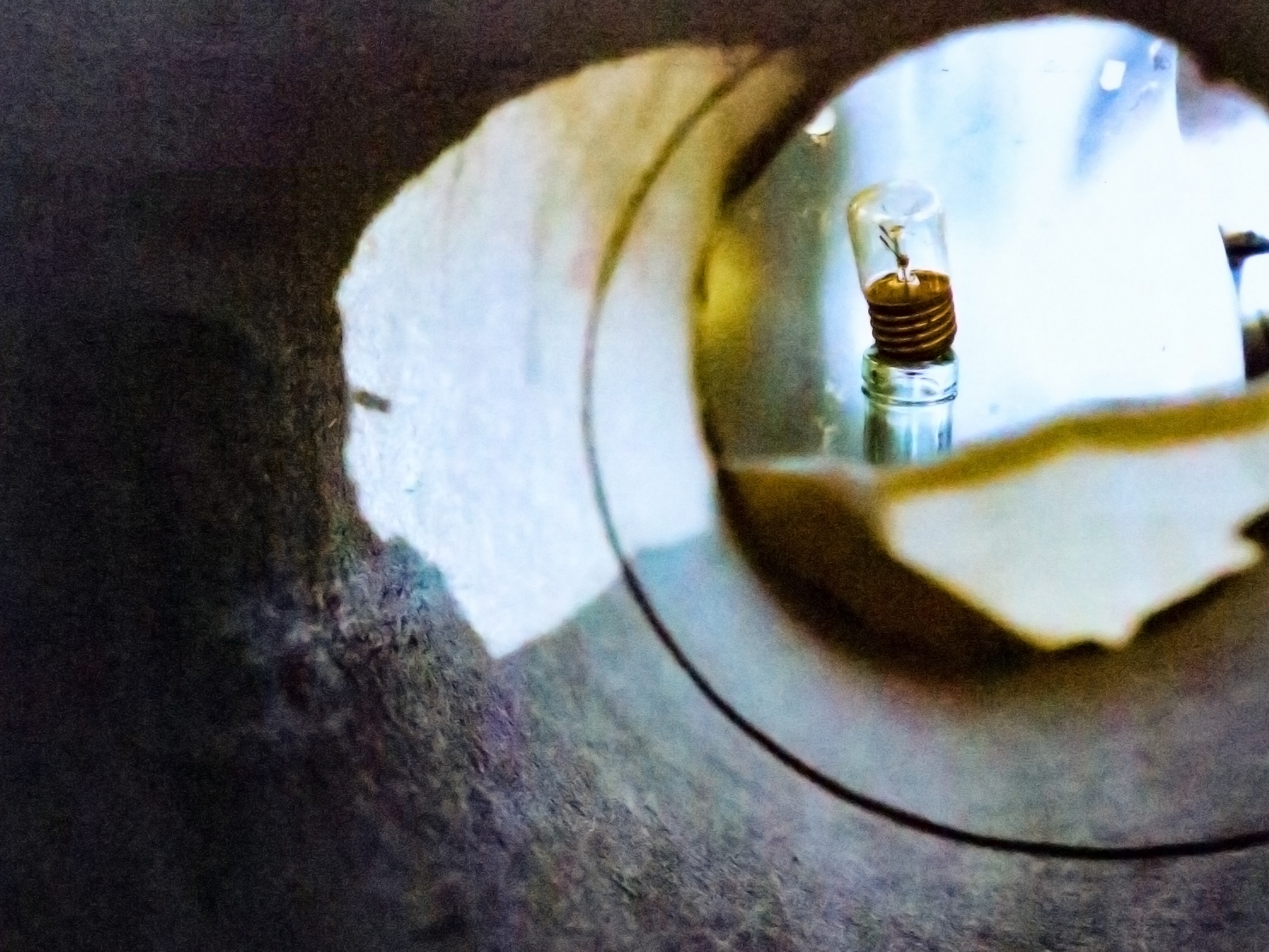
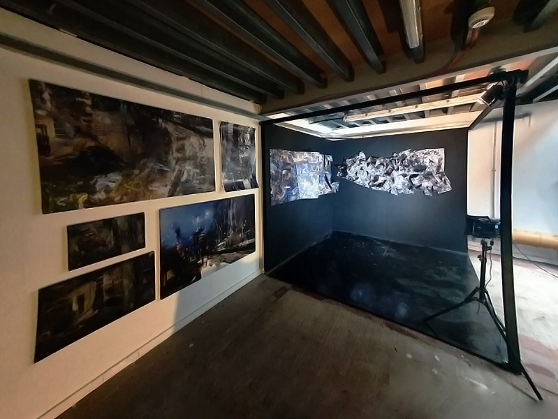
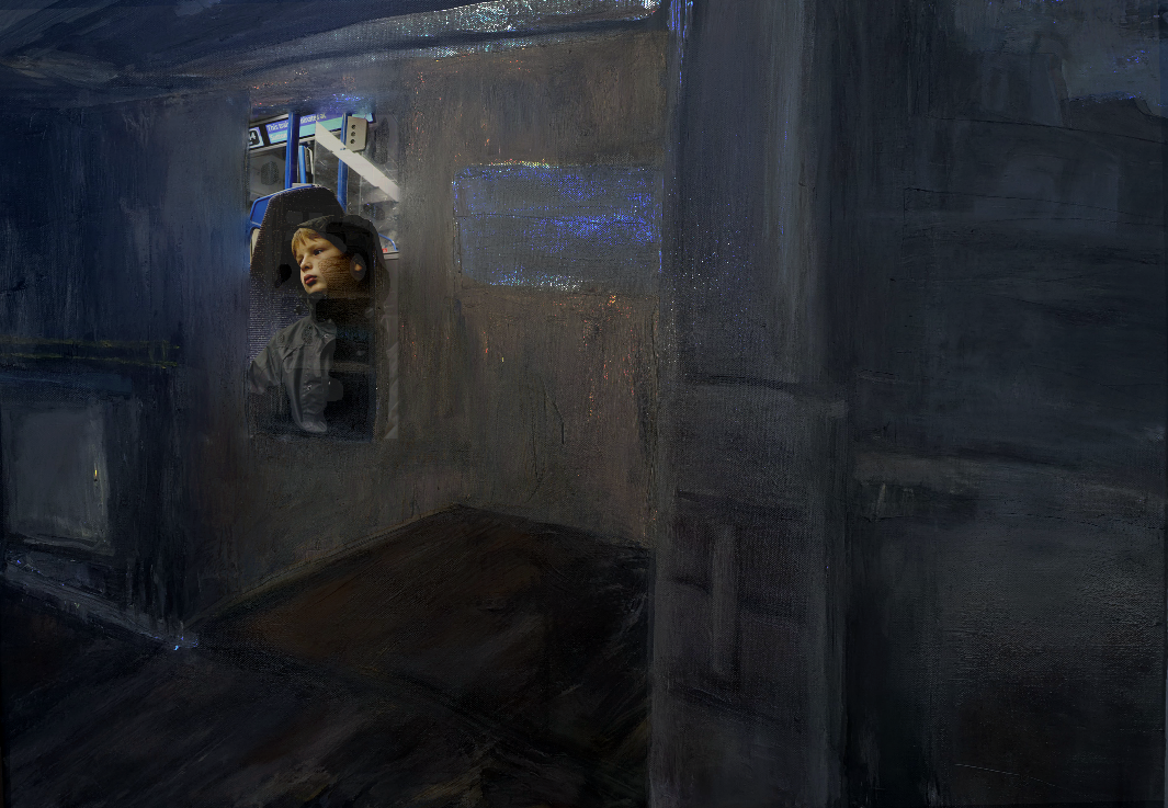
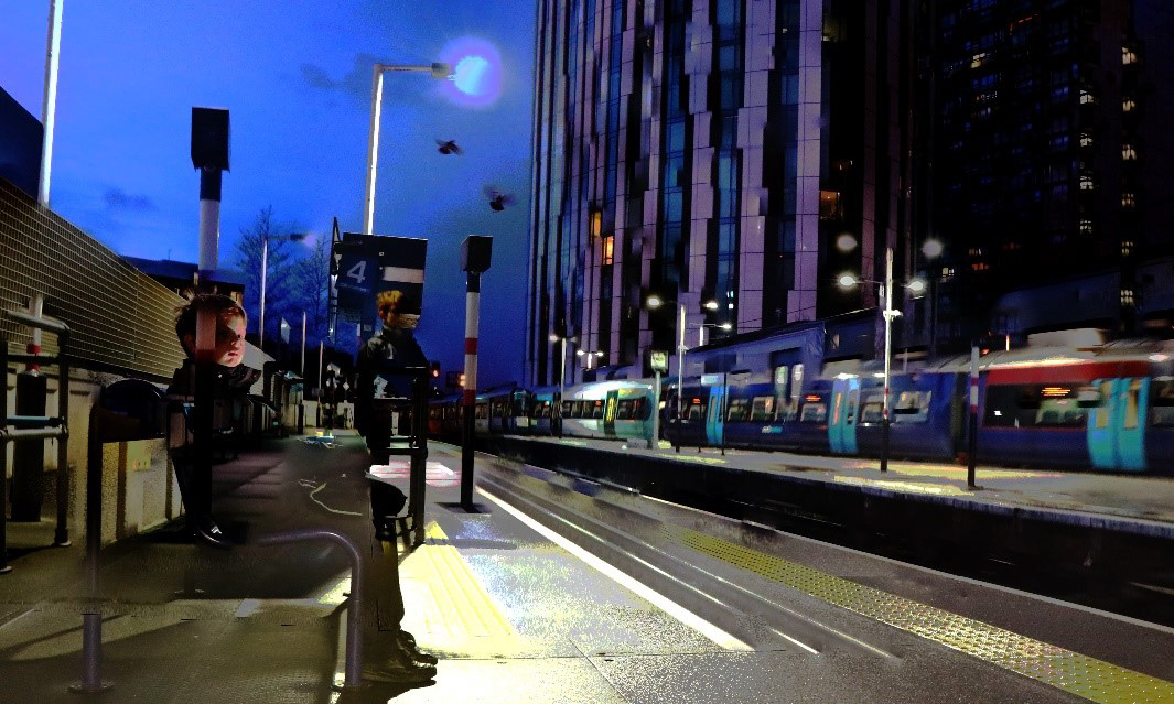
Inspired by a series of eerie, semi-surreal dreams that I had, I decided to see if I could convey their feeling through my artwork. I had previously used the merge tool on Photoshop to give my images a slightly surreal feel, and so I thought that this would be the perfect way to achieve what I had envisioned.
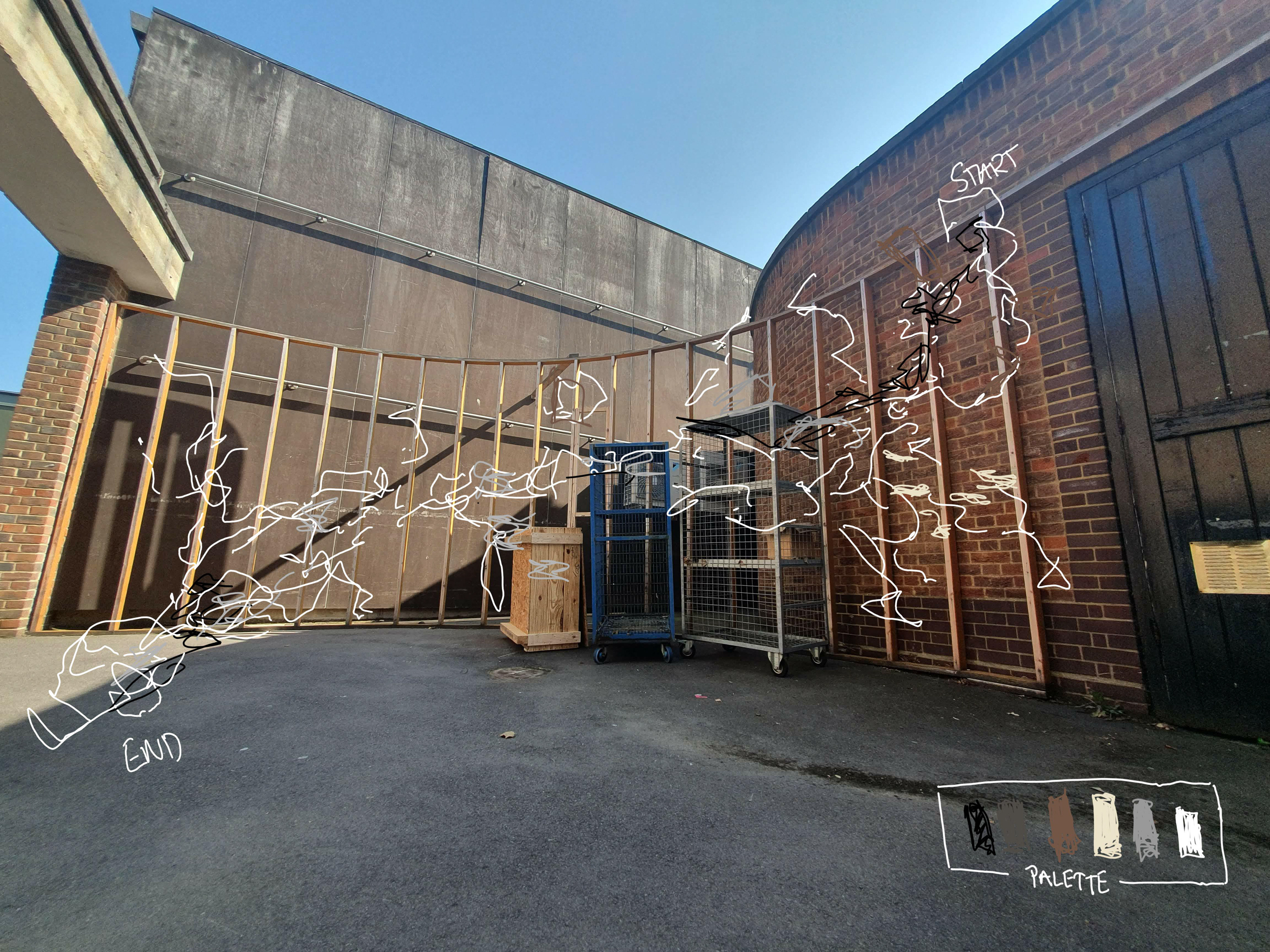
I wanted the viewer to be confused as to what was real and what was fake - so I did my best to blend my paintings and photos so you don’t know where the photo (the 'real') ends and where painting (the 'fake') starts, just like in a dream.
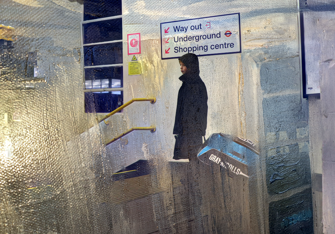
I wanted to go further into abstraction than just my photoshops, so I decided to turn to another transformative process: monotype printing. I hoped that this would help to capture the fleeting nature of dreams – and at first could appear to be a merely abstract form, but upon further inspection, the figure would reveal itself from the shadows. Just like many of the other processes I had been exploring, monotype printing almost takes the control out of the artist’s hands. To some extent, you can control the process, sure – in terms of the colours you choose, the paper you choose to print on, the image you paint. However, in printing the image, you never really know how it’s going to turn out.
For instance, for the first print, I had applied the ink too thickly, so it was squashed under the press and bled out over the rest of the image. Furthermore, I was interested in testing out monotype prints as I thought that this process could help me to imitate the texture that I so loved from the photoshops and from the paintings – the impasto, expressive brushstrokes.
While I was happy with the prints themselves, I felt as if they weren’t exactly what I was going for. They didn’t have a dreamy feel to them at all and felt slightly two dimensional. Therefore, I decided to turn my focus back to drawing from my images.
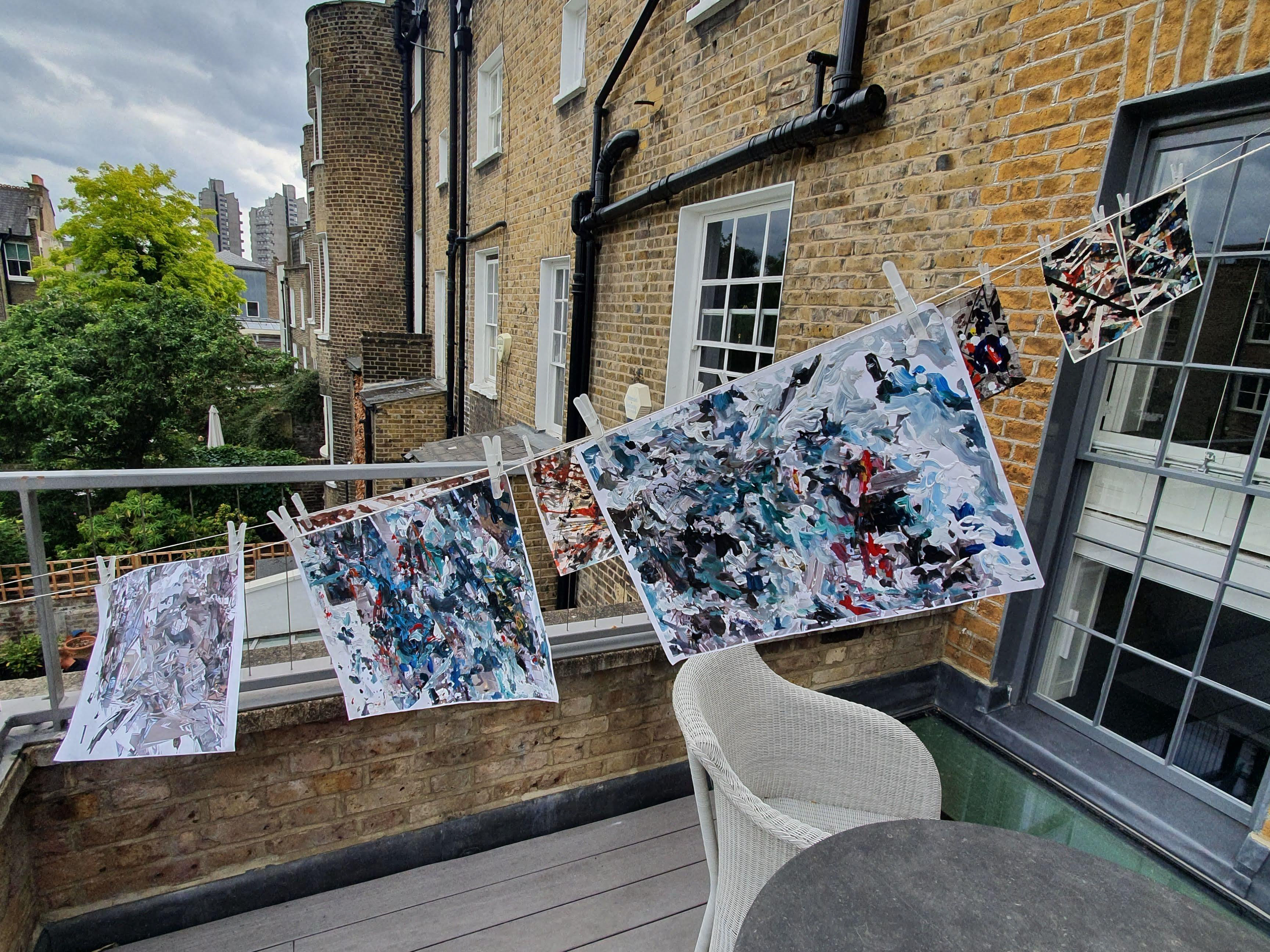
What I had liked about the oil pastels was the slight lack of control that they gave the user – and so therefore I was excited to try using oil bars, as they seemed like just a bigger version of oil pastels. I didn’t have as much range colour wise with the oil bars, but it was interesting to experiment mixing the different colours on the paper.
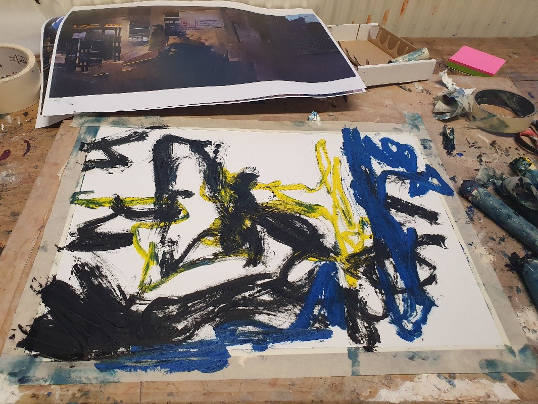
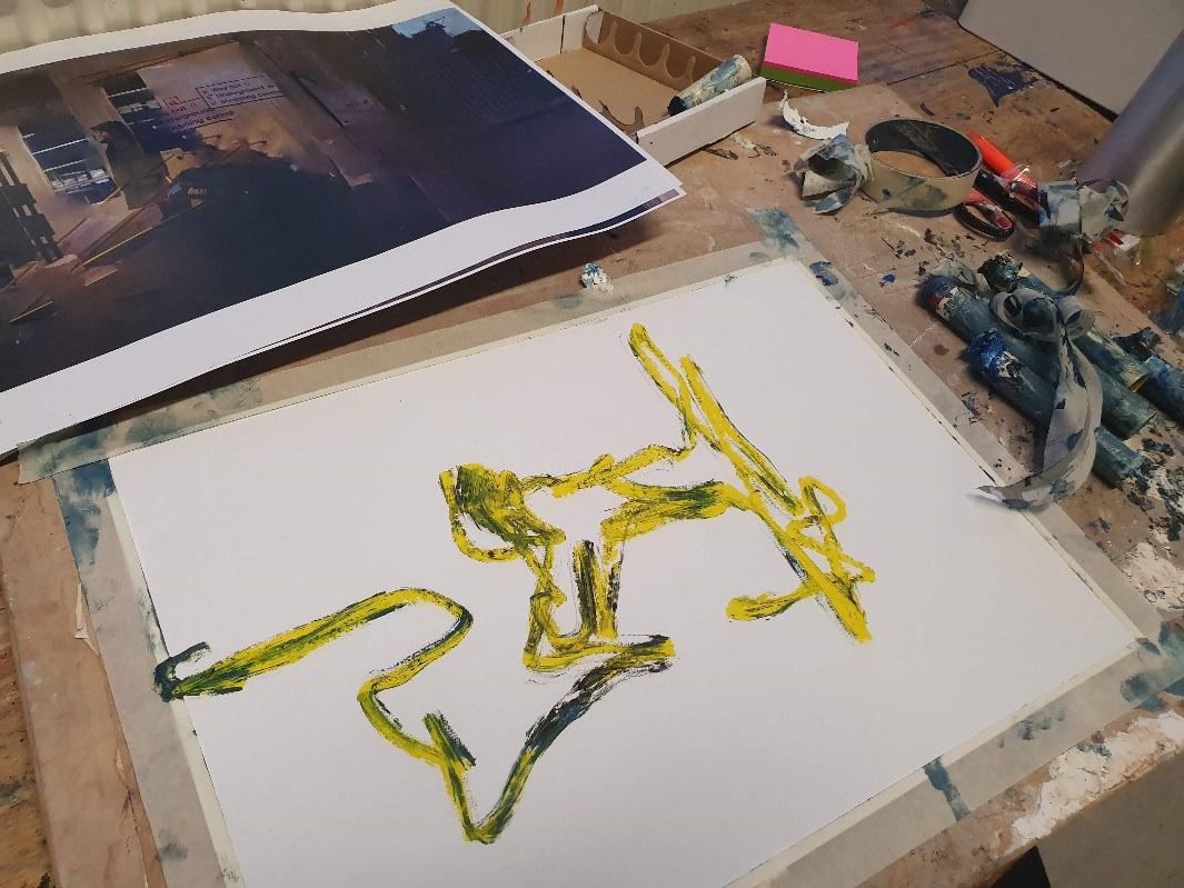
The oil bars were much more easy to spread than the oil pastels, meaning they were better for making expressive drawings – which was exactly what I was trying to do. With this new source material, I got back into combining the images in photoshop.
As I was combining so many photos, it was really key for me to keep these images cohesive. I tried to do this by sticking to the colour palette of the original photo, turning down the temperature of the photo to make the whites have a more bluish tone. However, I did not have to do much of this as the technology behind the merge tool tries to keep everything cohesive – as it was created to stitch together small photos into larger, cohesive panoramas.
I was extremely happy with these final images - I felt like they achieved exactly what I set out to do, as the viewer cannot tell where the image starts and the painting ends.
